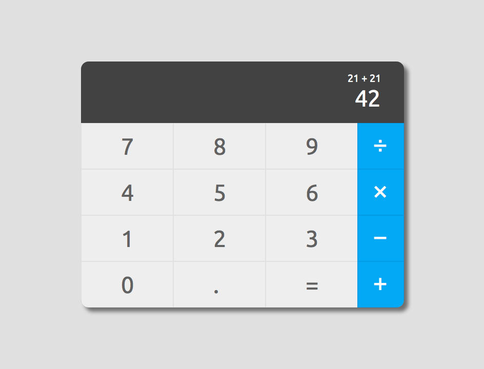
Daily UI #004 Calculator
October 23, 2015
This was by far the hardest thing to design. It’s just something you’re not really expecting to design, ever. I start to ask myself if there’s any point in designing a calculator when you can just type equations on Google and have the answer come up. At least, that’s what I’ve been doing whenever I need basic math.
But that’s not the point! The point is to design a UI for a calculator, so here we go.
Usually when I’m designing something, I think really deeply about it. I look at the goals of the project, the problem, possible solutions, etc. It’s been an interesting experience trying to come up with quick and dirty UI elements for Daily UI. I obviously can’t put in days of research and iteration into each and every one of these designs, but I find it somewhat difficult to “release” a design element that’s not perfect (by my standards).
Take this calculator for example. It’s missing the Clear button. I’m aware that this is a problem, and I’ve tried to fix it, but I can’t find the “right” solution in a short amount of time.
Anyway, It’s just the perfectionist in my talking. For now, this is good enough. Three in one day? I’m on a roll! 🤓
